There’s a common misconception that you need to avoid:
The idea that you have to sacrifice creativity when using data to design your website.
Tackling this myth requires you to take a step back and look at this battle from a broader view.
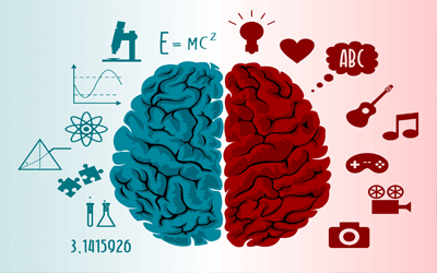
For example, consider art versus science.
There’s been a lifelong battle between these two ideas. Countless wars and revolutions were fought based on this conflict.
Luckily, where there is conflict, there is an opportunity for resolution. Let’s challenge the biggest assumption of this argument—the “versus.”
Why versus? Why not with? Art with science.
Creativity With Data
Most conflicts can actually result in amazing results for both sides if they took the time to sit down and just listen to each other.
You need to turn “head to head” into “two heads.”
Most conflicts can actually result in amazing results for both sides, if they took the time to sit down and just listen to each other.
How can you take design—which is inherently creative—and make it better by teaming it up with its counter part, data?
The first thing you need to do is understand the benefits and limitations of creating a design that’s only driven by artistry and a design that’s only driven by data.
Art-Driven Design
This type of web design is solely focused on looking really, really ridiculously good.
The motivations and goals of this type of design are:
- Catching the user’s eye
- Making them feel something
- Being memorable
- Expression, sending a message
- Standing out among the competition
- Inspiring users
- Establishing a high-end reputation
Here are a couple of websites that are very much so art driven:
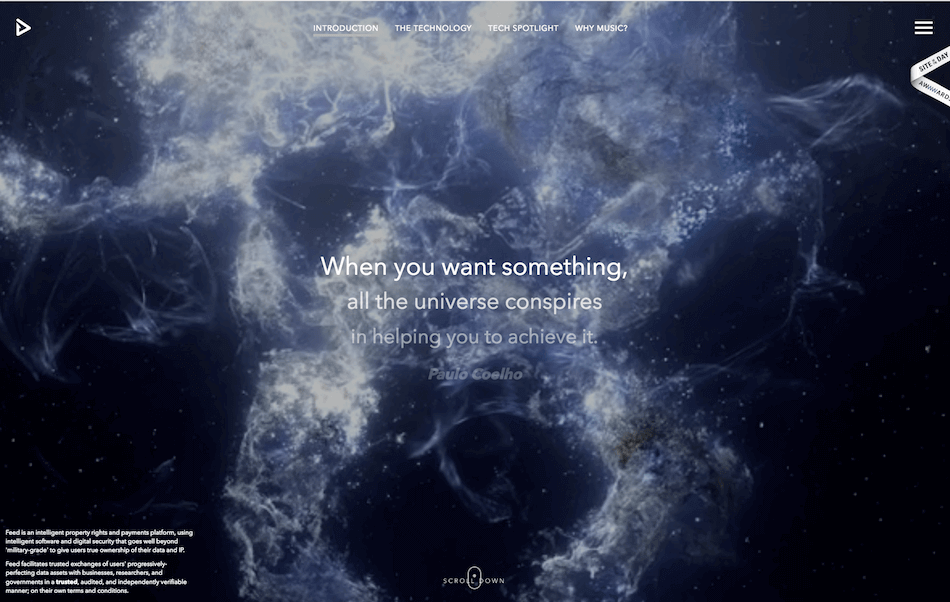
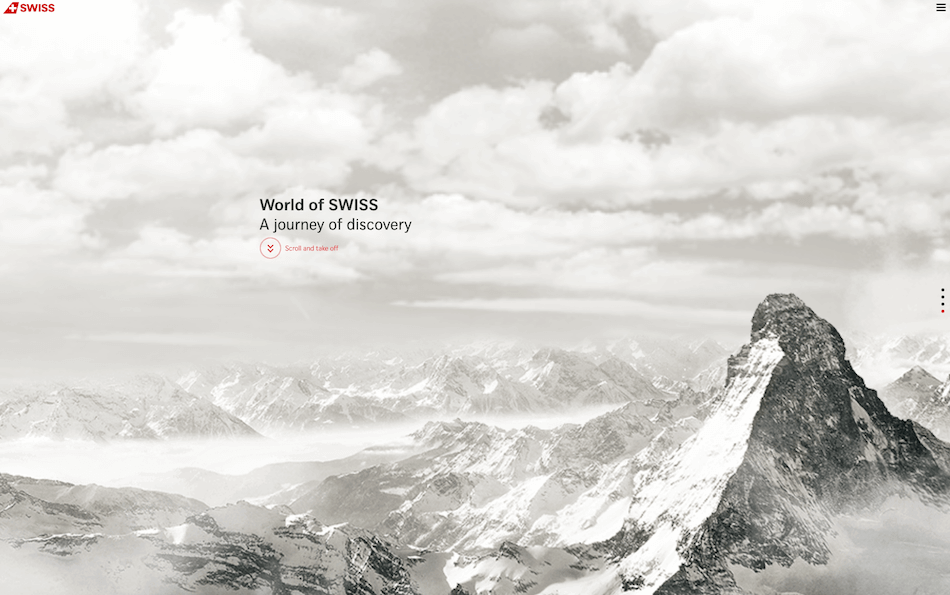
They do an amazing job of achieving all the goals listed above.
But what they accomplish in beauty, they lack in functionality and user experience.
As gorgeous as these sites are, it pains digital strategists like myself to see such an amazing piece of work go to waste. While the goal of art-driven design is to “wow” the user, they don’t do a good job of educating them or converting them.
For example, Feedmusic does an awesome job capturing your attention, but it’s “empty attention.”
…if the majority of your attention is on one element, it takes away from the focus you put on the rest of the website.
Your mind is stimulated by all the stunning animations and inspirational words. But these stimulations are not tied to what the brand actually does. It takes a good amount of scrolling and clicking before you can finally get a grasp of what they offer. By this point, the novelty of your experience has started to diminish. Your immediate association with the emotion the site conveys does not include what this company offers.
If you’re flying through the World of SWISS, your attention is on the artistry. Not so much on what makes them a better airline or how to easily book a flight with them.
Your attention is a finite source. That means that if the majority of your attention is on one element, it takes away from the focus you put on the rest of the website. The price of having art-focused web design is that people are admiring the attractive graphics, and consequently, they don’t understand the full value of what the brand is offering.
Data-Driven Design
This type of design is solely focused on using data to optimize your website.
The motivations and goals for this type of design are:
- CRO (Conversion Rate Optimization)
- Increasing the amount of engagement
- Decreasing friction
- Optimizing the user experience
- Taking a specific action (learn more, contact us, etc.)
Here are a couple of sites that are very much data-driven and tend to care more about the user experience than aesthetics:
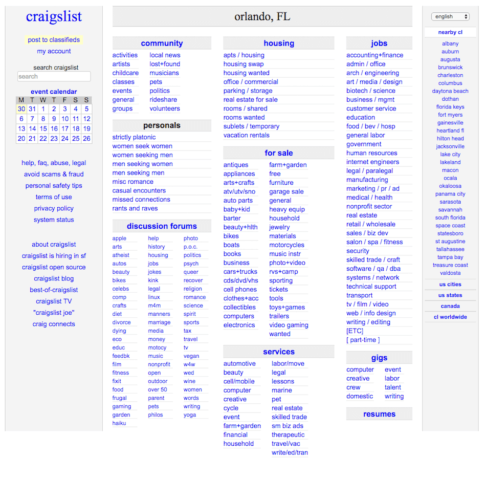
While these websites don’t have a lick of art or creativity, they get the job done. The core focus is functionality.
These sites can manage to get away with being functionality focused as they already have an established reputation. Imagine visiting a company’s website that you’ve never heard of or seen before, and you saw something like Craigslist or Reddit.
You’d associate the lack of creative effort to the company in the website, and your first impression will be your last, as you would most likely make a b-line for the “back” button.
But sites like these work because there’s less distraction. Distraction causes friction and can ruin the clarity of what your website is trying to communicate to the user.
Data-driven designs are also focused on performance. Some of those more art-focused websites may look cool, but they take a long time to load. This can cause users to give up on the whole site entirely, or it may give them the impression of impatience. Data-driven designs are focused on getting the user where they want to go as quickly and fluidly as possible.
Understanding User Data
The data you can collect on your website visitors is more intimate (and borderline intrusive) than ever. From the average time a user spends on a page to watching actual recordings of people clicking around your site, the capabilities at your fingertips are mind-blowing.
So yes, data can be overwhelming. But that’s because there’s so much of it available. The key is to identify the data that will provide real, actionable insights.
Quantitative Data and Qualitative Data
Quantitative data is information that can be gathered in numbers. It’s easier to collect and measure information using this type of data. Some examples would be population, website visits, bounce rate, etc.
Qualitative data is information that is gathered in a non-numerical form. This information is commonly the “why” behind the numbers. Some examples would be color preference, favorite brands, pet peeves, etc.
Collecting quantitative data can help you identify issues on your site, and qualitative data can help you solve them.
Example:
- Quantitative: All of your visitors are leaving your website from this product page at a rate of 90 percent.
- Qualitative: There’s a picture of feet on this page. The product is for a hat.
Disclaimer
Assumptions still peek their heads in when working with data. That’s okay because the data’s job is to help you prove your assumptions right or wrong. Just be emotionally prepared to be wrong — a lot.
Example:
- Issue: Your landing page with a form is converting at only one percent.
- Assumption: It’s because you aren’t doing a good enough job of convincing them why they need to fill it out. You need to add some badges and testimonials to persuade them.
- Reality: Users aren’t filling out the form because it’s just too damn long.
- How to avoid this: Have a deep understanding of your user’s intent, an open mind to what the issue is, and test, test, test.
Collecting and Using Qualitative Data
You can collect qualitative information by interviewing or surveying current customers or prospects. You can also set up slide-in or exit-intent surveys using tools like HotJar. With HotJar, you can also see click heatmaps and watch recordings of actual visits to your site. Creepy for them. Awesome for you.
Collecting and Using Quantitative Data
Quantitative data is much more accessible, but there is a lot more of it so you have to be particular on which data you decide to pay attention to.
You can use tools like Google Analytics and HubSpot to collect numeric insights about your current user base. You can even use social tools like Facebook Insights to understand some demographic data about your customers that might help you decide what direction to go with your design.
Creativity + Data—Tying It Together
In web design, you want to tie art and science together. Make the user feel impressed, but also make sure they immediately understand what value you offer.
When you can pair the comprehension of “what” to the “wow,” it gives users a better narrative or story to build in their heads, which will lead to an even more memorable experience. More importantly, they will remember the right things about it, like what your company actually does.
So, one design tactic is all about being thought-provoking and emotionally stirring, while the other is all about creating a fluid, quick experience.
Creatives have an internal need to express themselves on an aesthetic level, while data analysts have a strong desire to follow the numbers. Fortunately, there are plenty of ways that both of these personas can meet their needs while satisfying their website users at the same time.
If an artist can truly understand who they’re creating for, they will have no problem speaking them [the user] through their design.
You want to use data to help identify opportunities to provide creative solutions.
For example, if data shows that your users are impatient and don’t read all of your content, a creative solution would be to offer an engaging, fun video to the top of your heavy-content pages so that users can consume information in an easier way that fits their behavior.
Or maybe your data shows that the majority of your users have children. A creative solution would be to incorporate design and art that evokes a similar emotion that most parents might feel: pride, protection, fear, etc.
Simply put, the analyst helps you identify a problem, and the artist helps you solve it.
Here are some types of data you can collect about your users:
- Do user interviews
- Observe their website behavior
- Send surveys
- Use slide-in surveys
- Test different article topics to see which ones get the most engagement
- Understand their pain points, needs and desires
- Understand their goals and what they need in order for them to look good among their peers
If an artist can truly understand who they’re creating for, they will have no problem speaking them through their design—which should be a combination of data-driven design and creative web design.
Virgin America and SquareSpace do an awesome job marrying the two here:
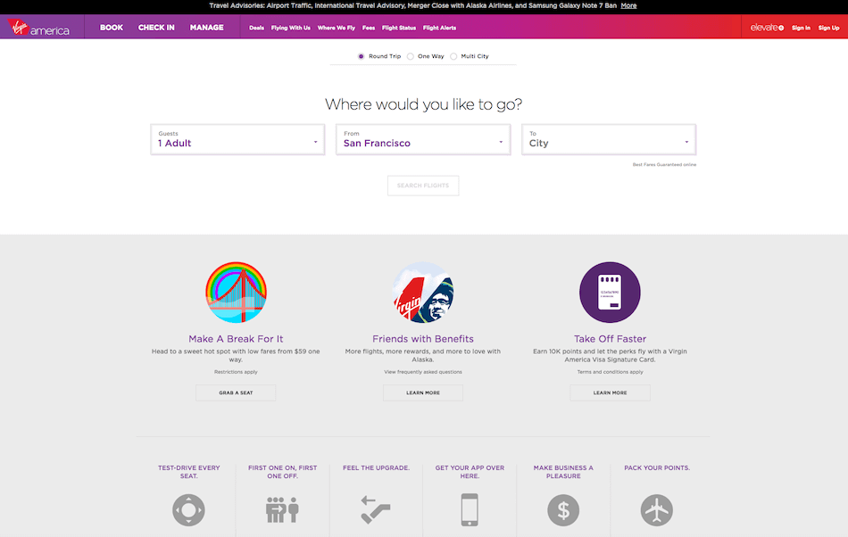
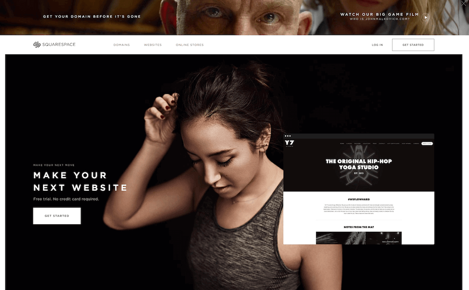
Both of these sites pay special attention to visual and functional elements. They cater to their specific user.
- They show them something visually attractive.
- They clearly communicate the value of the offered service.
- They provide the right “action” to make it easy for users to find what they are likely looking for.
Along the way, you should constantly be challenging facets of your site to see if you can make it better. Use the data, analyze and identify any problem areas, and put on your creative hat when coming up with a solution.
Remember, it’s no longer art versus science. It’s art with science.
So be sure to use these two approaches (data-driven design and creative web design) to achieve your best website yet.