
Have you looked at the traffic coming in organically to your site? It’s highly likely that a noticeable amount of traffic is coming through mobile.
Does your website play nice with mobile? Circle ‘Yes’ or ’No.’
For Google, the answer to that question is binary and a ‘no’ answer is going to hurt you a lot more than it used to—especially if you haven’t been paying attention to the recent changes in the way Google ranks websites, in particular relating to the entire mobile user experience.
This makes sense. If Google wants to produce the best search results for BOTH its mobile and desktop users (and it does), it must take mobile into account because there are more people using their smartphones to search the internet than their desktops.
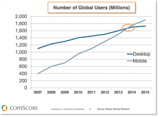
Let’s take a stroll back to 2015. After mobile users surpassed desktop users, Google started to hone in on the mobile experience to determine whether a site was “mobile friendly” (a gauge of mobile responsiveness, performance and user experience). Search Engine Land referred to these mobile targeted updates as Mobilegeddon and Mobilegeddon 2.0. It sounds like a horrible disaster film franchise. In reality, it was a war against non-mobile friendly sites.
Google never rests.
And Google is serious about fast mobile web. In 2016, Google launched its open source AMP Pages project as a way to encourage and improve search performance over mobile. Of the ~200 ranking factors that Google uses to separate the weak from the strong when ranking sites, mobile friendliness ranks near the top.
Since 2015, the percentage of mobile phone website traffic worldwide has steadily increased, now sitting at 52.2% in 2018. In January, Google made their latest announcement about a Speed Update planned for July 2018. Page speed, or how fast the content on your page will load, will officially become a ranking factor for searches on mobile. Google’s plan is that this update will only impact the slowest delivering pages.
Well, Google has set the bar. How can you ensure your pages load fast enough to rank in Google’s SEO? What do we do first? When determining what you’re going to do improve the mobile-friendliness of your site, it’s best to first put yourself first in the shoes of your visitor, and then think about rankings. Take what Michael from Google’s Webmaster Relations Team stated during a Mobile Madness QA session: “Don’t chase the algorithm, focus on the user experience” Or in layman’s terms, no degree of technical knowledge or SEO optimization strategy can save you from a horrible on-page user experience. Concern yourself with the viewing and interactive experience of your site.
There are a few factors that Google has admitted negatively impact the mobile user experience. Focus on addressing these issues first:
- Text that is difficult to read on a mobile device hurts the mobile experience, especially if your visitor has to tap or zoom on to things in order to see them.
- Links and buttons that are placed too closely together will negatively impact the mobile visitors on your site.
- Bad navigation, structure and hierarchies. If someone has to drill down to get to the information they need or their goal for going to your site remain unachieved, they are more likely to abandon your site—especially if they’re staring at a tiny screen. Plainly put, if your visitor doesn’t get what they’re looking for quickly, Google will perceive your site as having lesser value compared to a site that someone can quickly dive into, find their answer and remain entertained even after they achieved their goal.
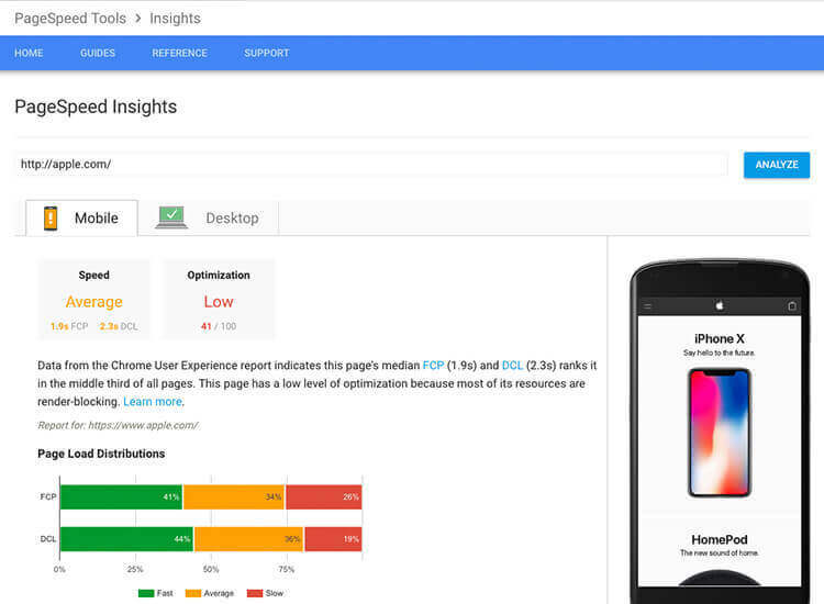
- Slow page load speeds. Mobile users expect lightning-quick speed when loading and navigating your site. Does your site still use that resource hog Flash or is it too image heavy and you’ve failed to compress your images? All these factors influence page load speed. To analyze your page speed insights and see where you need improvement, check out Google’s PageSpeed Tool.
Some webmasters will have an easier time than others updating their sites to be mobile responsive. It might be an easier and more logical option for you to start over by building a new site using responsive design, rather than fix all of the issues impacting the mobile experience, especially if the technology you used to build it is antiquated. Don’t worry about creating a separate mobile version of your site. Just build something that anyone can properly view.
If you want to take your website design a step further, you can shape your site based upon a Growth-Driven Design (GDD) strategy that focuses on tracking your visitor interactions and experiences on the site to help you determine what’s performing and what’s not so you can make strategic updates to your website. GDD naturally pairs with the inbound methodology, which naturally factors and accounts for user experience along the way.
