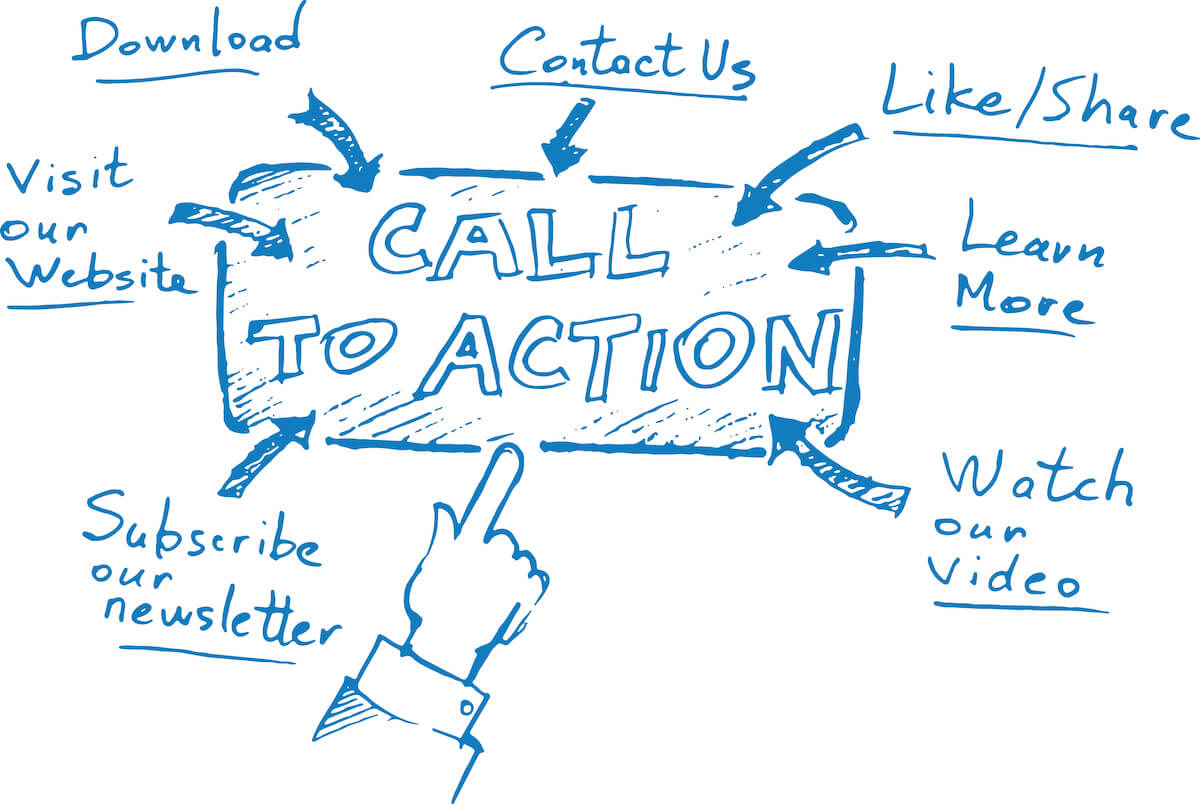
When looking at ways to improve your conversion rate, one of the most critical elements you need to focus on is your call-to-action (CTA) buttons. These are the little powerhouses that can make or break your digital marketing strategy by motivating users to take action, such as “Sign Up Now,” “Get Your Free Trial,” or “Buy It Today!”
But let’s face it; not all CTAs are created equal. What makes a CTA button truly effective? Is it the color, the wording or the placement on the page? Or is it something deeper, something rooted in the psychology of user behavior?
The answer is all of the above! Effective CTAs grab your user’s attention and persuade them to take action. And to do that, you need to understand the psychology behind what makes CTAs so powerful.
Understanding the Psychology of Call-to-Action Buttons
To design effective call-to-action buttons, it’s essential to understand the psychology behind user behavior. By understanding what motivates users to take action, you can create CTAs that are more persuasive, engaging, and ultimately more effective at driving conversions. Here are some key psychological principles to keep in mind when building your next button:
The Fogg Behavioral Model
The Fogg Behavioral Model, developed by Dr. BJ Fogg at Stanford University, explains that behavior is driven by three factors: motivation, ability, and prompt. In the case of CTA buttons, motivation refers to the user’s desire to take action, ability refers to their capability to do so, and prompt refers to the cue that triggers them to take an action. To create effective CTAs, you need to design buttons that are highly motivating, easy to use, and triggered by the right cues.
Visual Cues
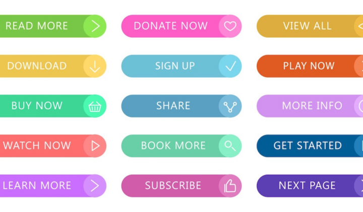
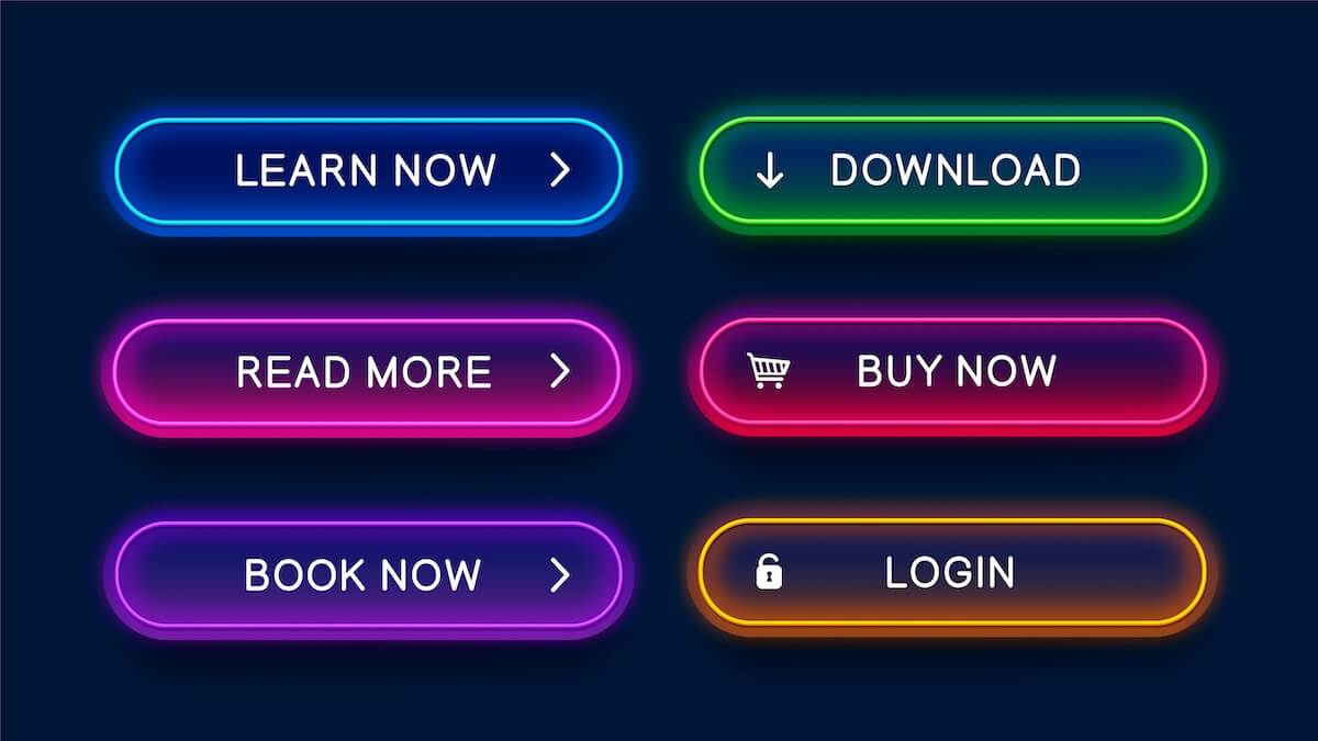
Visual cues play a critical role in the design of effective CTAs. The color, size, and shape of a button can all influence user behavior. Some research has shown that red or red-ish buttons tend to perform better than other colors, but one of the most important considerations when it comes to color is contrast. the higher the contrast, the more eye-catching the button is. Be sure to use a button color that doesn’t blend into your background or other elements of your page.
Larger buttons are typically more attention-grabbing than smaller ones. Similarly, rounded corners on a button can create a sense of comfort and trust, while sharp corners can convey urgency and action.
Emotion and Urgency
CTAs that evoke emotions like excitement, curiosity, or fear can be incredibly effective. Similarly, adding a sense of urgency to a CTA can create motivate users to take action thanks to the scarcity principle. Using language like “Limited Time Offer” or “Act Now” can make users feel like they need to act quickly to avoid missing out on something valuable.
Cognitive Fluency
Cognitive fluency refers to how easy it is for users to understand and process information. Buttons that are easy to read, with clear and concise wording, tend to perform better than those that are complicated or confusing. Similarly, buttons that are visually simple and easy to find on a page can help users make quick decisions and take action more easily.
Best Practices for Designing Effective Call-to-Action Buttons
Compelling and Action-Oriented Copy
The copy you use on your CTA button can significantly impact how effective it is. Use action-oriented language to encourage users to take action, such as “Sign Up Now,” “Download Your Free Guide,” or “Get Started Today.” Avoid vague or non-specific language, such as “Learn More,” which can be less motivating and unclear. Consider using first-person language as well; one study found a 90% increase in click-through rate with their “Create Your Account” CTA when they swapped “Your” for “My.”
Placement on the Page
The placement of your CTA button on the page can also greatly impact its effectiveness. Generally, it’s considered best practice to place your CTA above the fold (i.e., on the top half of the page that is visible without scrolling). The exception here is long-form content, blog posts, as users who have engaged with your content may be more likely to take action if you place a CTA at the bottom of the page. Ultimately, you’ll need to test different placements to determine the optimal location for your CTA, which you can do through…
A/B Testing
A/B testing is a process of comparing two different versions of a webpage to see which one performs better. This can be a powerful tool for optimizing your CTAs. Try testing different colors, button sizes, or copy to see which version performs better. You can do this on your site using tools like VWO, Optimizely, and Crazy Egg. Some tools, like HubSpot and various mailing platforms, even have a built-in A/B testing feature! Over time, you can refine your CTAs to make them more and more effective.
Mobile Optimization
As of March 2023, mobile users make up over 60% of all web traffic, with mobile traffic remaining consistently higher than desktop users since 2017. With more and more users accessing the web from mobile devices, ensuring that your CTAs are optimized for mobile is essential. Ensure your buttons are large enough to be easily clicked on a mobile screen and the text is clear and easy to read.
Use of White Space
White space, or the space between elements on a webpage (also known as negative space), can have a big impact on how effective your CTAs are. By using plenty of white space around your CTA button, you can make it stand out more and draw the user’s attention.
Congratulations! You now have the tools and insights you need to create killer CTAs that will take your website to the next level. By understanding the psychology of user behavior and following best practices for CTA design, you can create buttons that motivate users to take action and achieve your digital goals.
So go forth, experiment, and have fun creating CTAs that truly stand out! With a bit of creativity and a lot of know-how, you can create buttons that not only look great but also get results. Cheers to effective CTAs and a thriving digital presence!