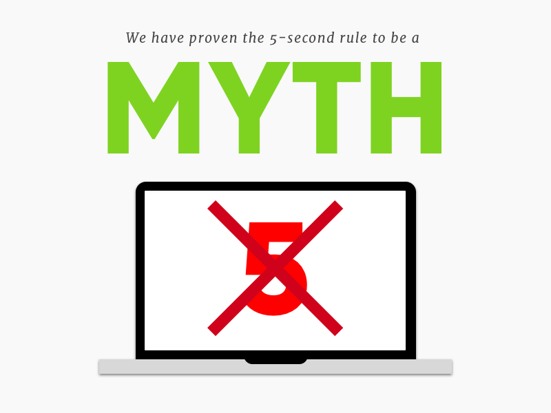
Have you ever heard of the “5-second rule”? No, not the one where you can still eat that muffin if it hasn’t been on the floor five seconds. We’re talking about the website 5-second rule.
The rule states that unless you grab your website visitor’s attention in five seconds or less, you’re likely to lose them.
Soon, you’ll discover that this “rule” is actually a myth. You’ll also learn how you can overcome bad first impressions and how to make sure you’re using design to keep your visitors impressed the first time they see you.
Why Your Home Page (the First Impression) Is So Important…
Before you understand how to master the first impression, you need to understand why it’s so important.
So why does your website need to have a tasteful and attractive design?
British researchers performed a study in which they analyzed how different design and content factors influence the trust of online health sites.
So what were the results?
They discovered that the look and feel of the design of the website was the main focus of the first impression.
94 percent of all the feedback was about visual appeal.
That means that only six percent of their judgement was the content─words the website was actually using.
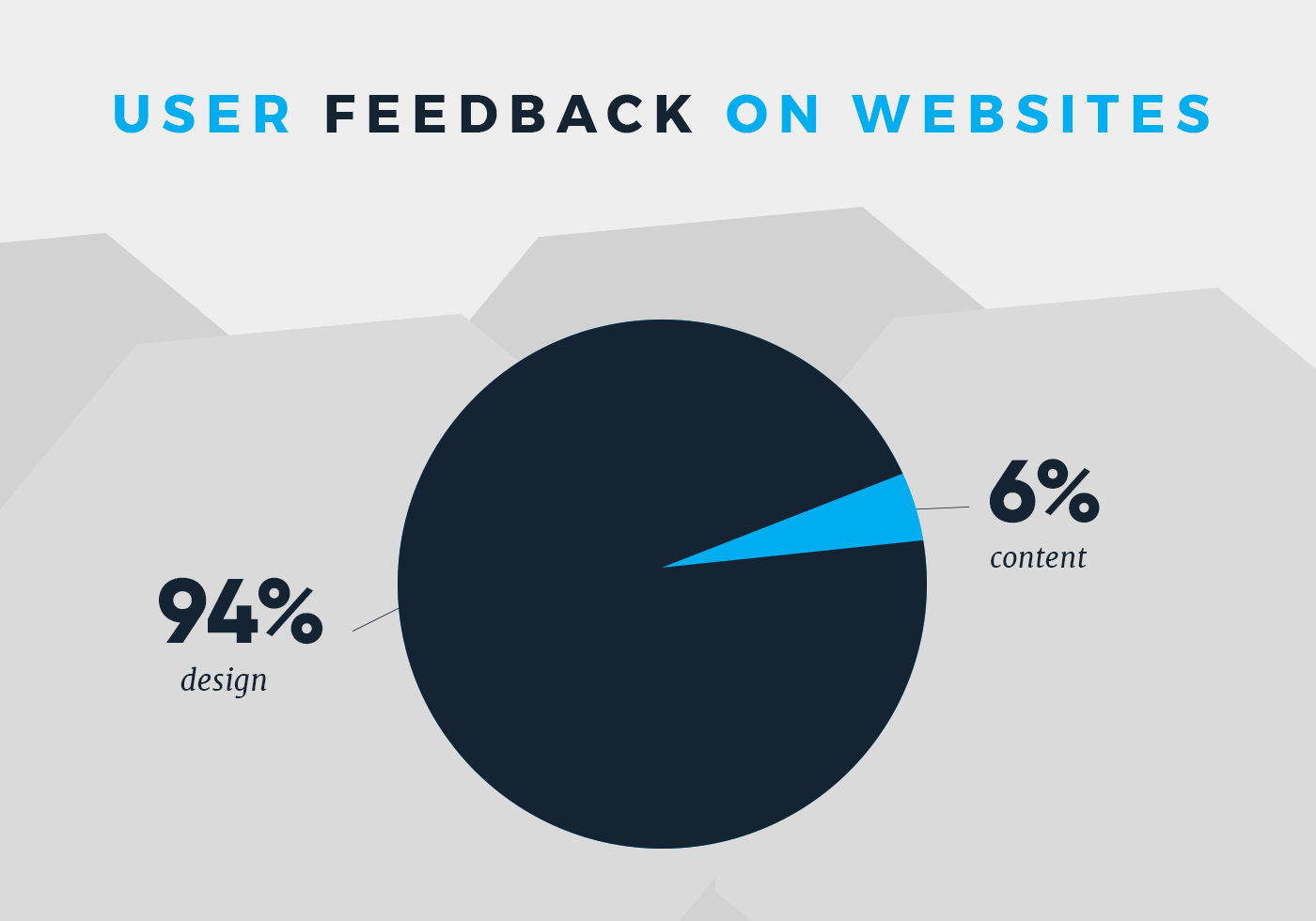
Some examples of their feedback included: too complex, busy layout, lack of navigation aids, boring web design (especially use of color), pop-up adverts and corporate look and feel.
In this case, a picture isn’t just worth a thousand words. When it comes your website’s first impression, it’s worth 94 percent.
It’s important to point out here that if a user experienced poor design, their trust of the website dropped dramatically. In most cases, they wouldn’t navigate further than the home page if they were turned off by any of the home page’s design.
Not only are visitors’ first impressions mainly influenced by design, these impressions happen quickly. Very quickly.
Remember that 5-second rule? Yes, the one that claims you have five seconds to capture a user before you lose them.
Well, it’s less than five seconds. A lot less.
Under 50 milliseconds to be exact.
Google performed a study to see how quickly people decided to stay or leave a website after landing on it.
In 17 to 50 milliseconds, users had formed their opinion or initial “gut feeling” to decide whether to stay or leave the site.
So in reality, you don’t have five seconds. You have half a second.
The researchers dug deeper to understand what factors influenced the user’s gut feeling. The ones that succeeded in grabbing a user’s attention were ones with low complexity and high relevancy (how the design usually looks for that industry of websites).
In other words, in that half a second, their gut feelings were based off of simplicity and if they saw something like what they were expecting to see.
This goes to show that you want something that’s beautiful, but practical. You shouldn’t sacrifice functionality for aesthetics.
So you’ve learned what visitors are judging in their first experience with your site and how quickly they do it. But how long does the first impression last?
As you’ve probably heard before, “you never get a second chance to make a first impression.” This is especially true for your home page.
Scientists conducted a study where they showed a picture of an individual to a focus group on a computer screen with a negative quality about that person.

Later, they showed them the same picture with contradicting information (good qualities).

Their first impression still dominated.
Even when they were explicitly told that the original (negative) information about the individual in the picture was wrong, they still held a negative feeling about them.
This proves how important it is to not screw up your visitor’s first impression with your website. Even if your product is drastically better than the competition, people will continue to associate your brand with a bad experience.
But there was another discovery in this study that proved hopeful.
When they continued to show the image with contradicting information (good qualities) and changed the color of the background, the group’s bias of the first impression started to actually decrease.

“What is necessary is for the first impression to be challenged in multiple different contexts. In that case, new experiences become decontextualized and the first impression will slowly lose its power,” the researcher said.
“But, as long as a first impression is challenged only within the same context, you can do whatever you want. The first impression will dominate regardless of how often it is contradicted by new experiences.”

So if you make a bad impression on your website, don’t just change small elements. You need to completely change the context and environment to establish a new impression and make them forget about the first one.
Now you understand why your home page is so important. Time to dive into how you can optimize it to make the best first impression possible.
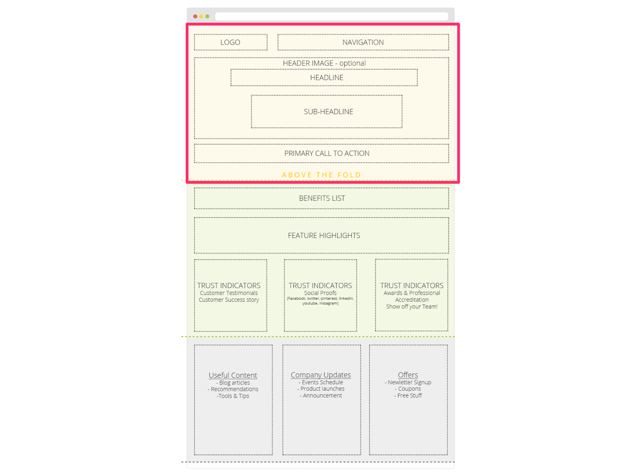
Optimal Organization For Your Home Page
The very first thing you want to do is make sure your home page is formatted in a way that’s easy for the visitor to comprehend.
As far as the details, it depends on your industry.
Are you a travel industry focused on bookings? Then maybe the search functions (location, venue etc.) should live inside the hero image.
Are you a law firm? Maybe you should have a contact form easily accessible from the hero image (or a CTA that brings you there).
With that said, there are still principles you can follow to at least get you started.
Your hero region is the true first experience. This is where you have to nail it.
Source: http://www.websitebuilderexpert.com/awesome-home-page-design-layouts/
The hero image should create an emotional connection with your website visitors. Of course this depends on how much you know about your customers.
A good principle to have here is to show your visitors an image (or video) of what their “happy ending” looks like.
Take this example from Bethel Farms.
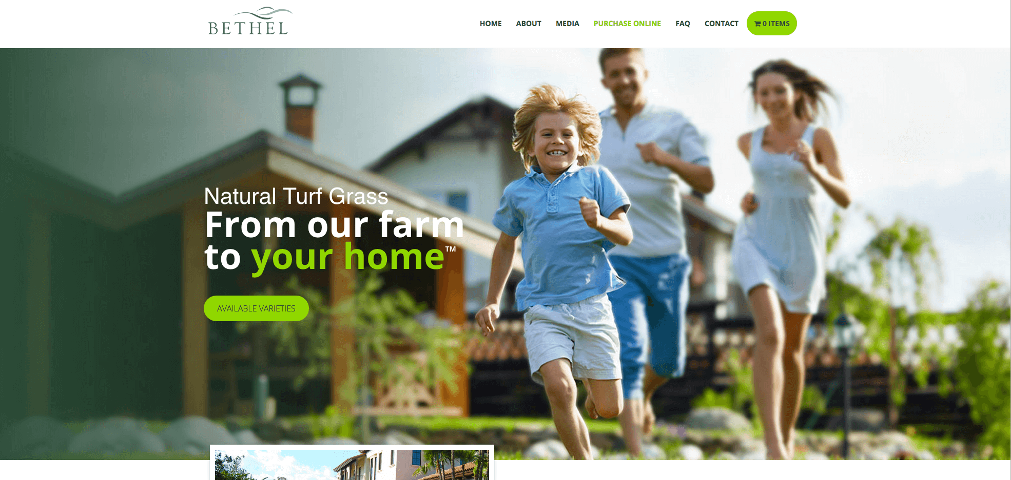
When creating this site, our designer took the time to understand the ideal persona and crafted imagery and messaging that showed exactly what their “happy ending” looks like if they engage with Bethel Farms.
You also want to include what your company’s main value is, phrased in a way that is user-centric. You should also have a CTA that brings them to the next logical step in their journey.
The next region is known as “below the fold.”
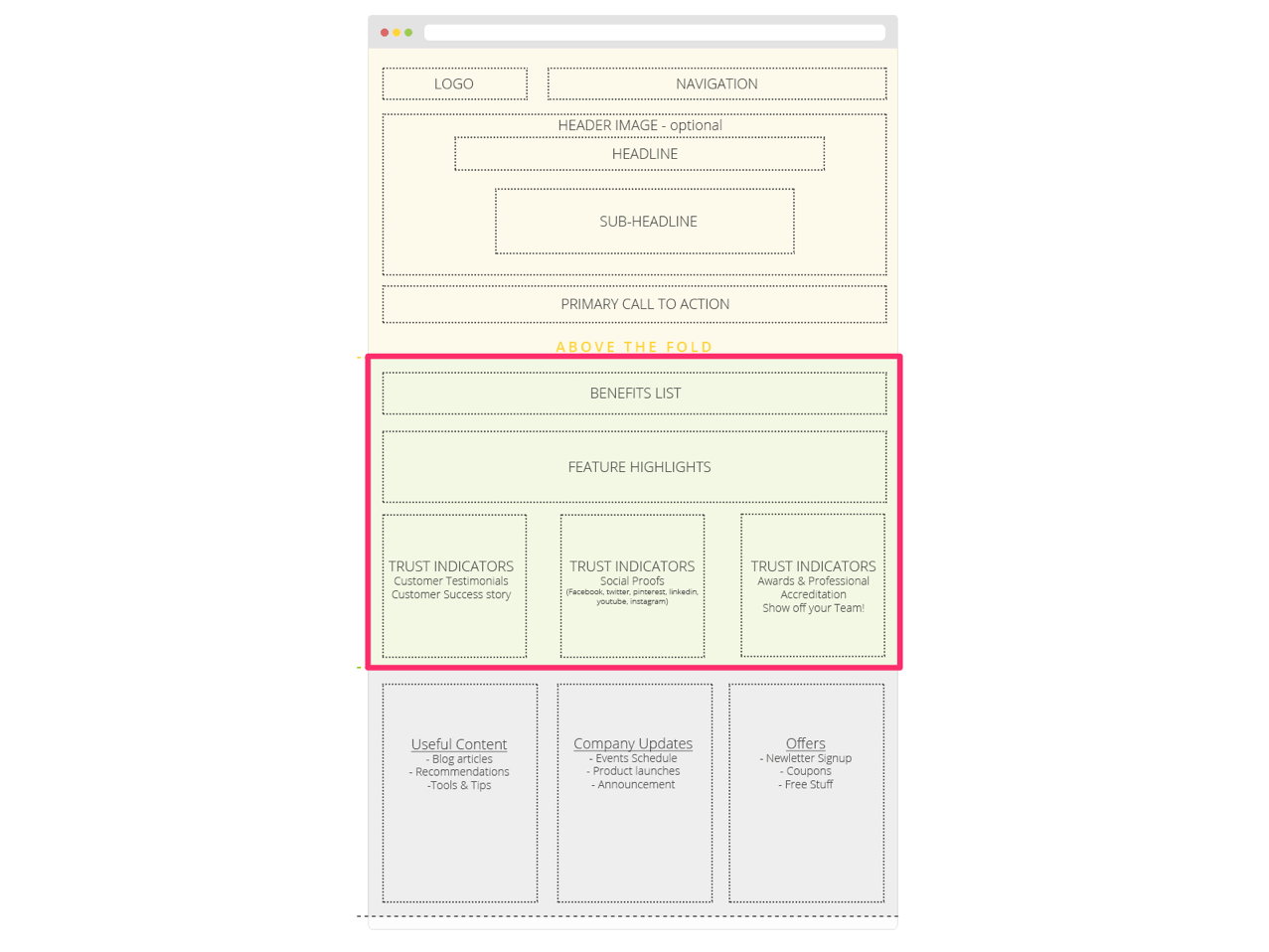
What you put here and in the following region definitely depends on your company and industry.
Traditionally, this section communicates what you offer. Especially if you are ecommerce, you want your visitors to immediately understand that you sell things from your site and what those things are.
When listing your product/service offerings, include the benefits of each one. It’s important to not confuse “benefits” with “features.”
“Features” are physical characteristics of your product. “Benefits” are user-centric they communicate the value that your customers will get out of using that specific offering.
Example:
This TV is 52’’ with 4k quality and top of the line sound quality – Feature.
This TV will make you feel like whatever you’re watching is actually in the room with you – Benefit
Features do have a place on your site, but not the home page. Your home page should house skim-friendly content that catches the visitor’s attention and motivates them to continue clicking through the site.
You can also include social proof, accolades or badges of authenticity in this area.
If your hero region does a good enough job helping visitors get a full understanding of what you offer, then it’s appropriate to have the very next region be the most influential part of your home page.
The goal of this region would be to establish your brand as top notch in the eyes of people just like them or in the eyes of other authorities within the industry.
If you serve high-profile clients or are featured in industry-leading publications, you can include their logos in this area as well.
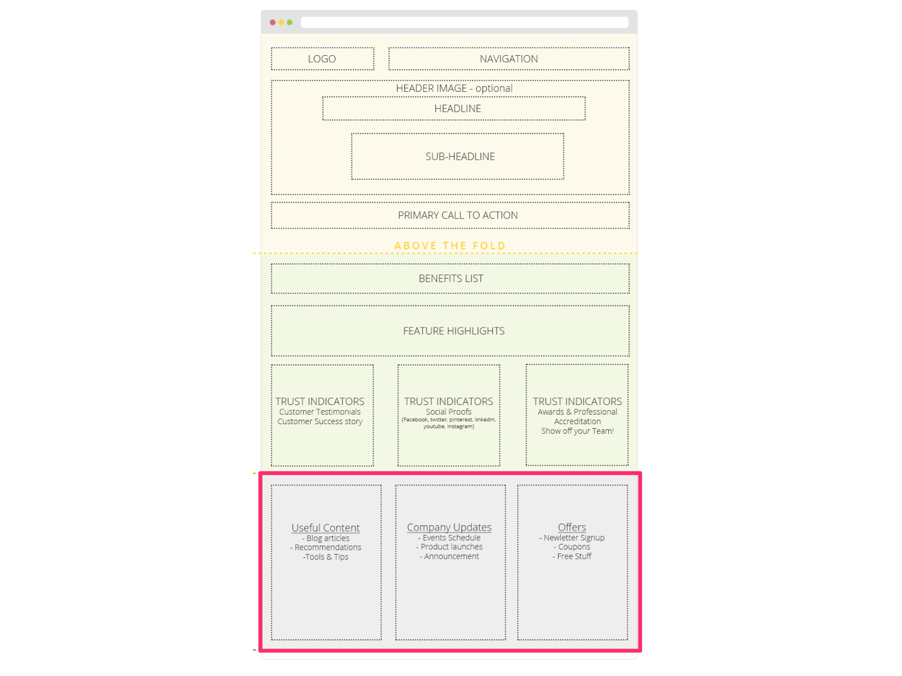
As you get toward the bottom of the home page, this is where you can talk a little bit more about yourself. Most users don’t make it this far down, but if they do, it means they’re interested.
This region can include special offers (sales, e-books), recent articles, recent news, newsletter signups, social feeds, or even contact information (like a map).
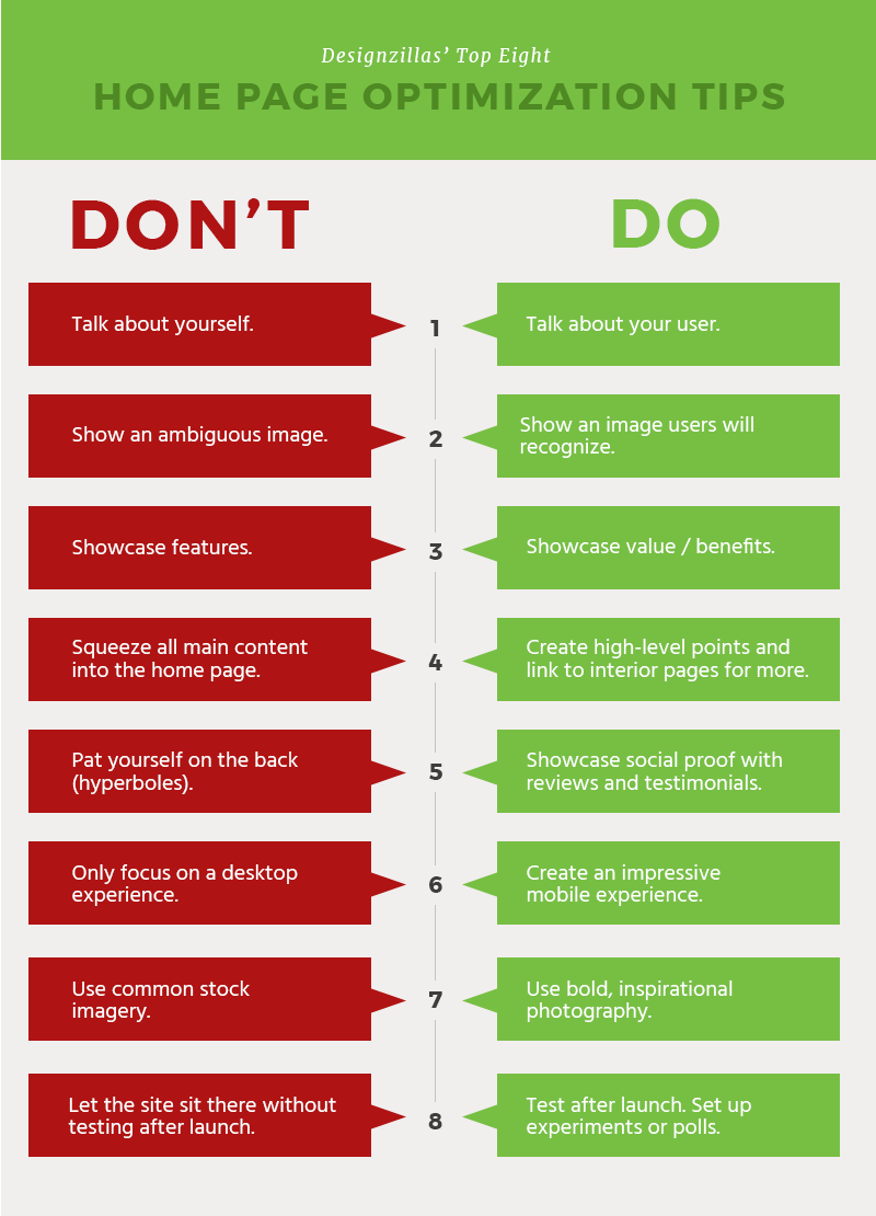
Home Page Do’s and Don’ts
Below is an infographic with some best practices to keep in mind when designing your home page. Some of these might seem pretty obvious, but you’d be surprised how often people get it wrong.
Summary and Conclusion
- Design is the primary factor that visitors use when judging your website. Make sure it’s done well!
- You don’t get a second chance to make a first impression. Users make that first judgement very quickly, and it sticks with them for awhile.
- Your home page’s hero region is where you want to make a real connection with your visitors. Show them what their “happy ending” looks like and communicate the value your business can provide to them.
- Under the fold, you can showcase the benefits your product/service can provide. It’s also best practice to feature your testimonials, social proof and accolades here.
- At the bottom of your site, this is where it’s more appropriate to talk about yourself. Provide your deals, newsletter signup, recent blogs, maps, and other promotional items.
- Make sure you are re-visiting your home page consistently and asking yourself if you are violating any of the home page “do’s and don’ts.”
Cheers!